
I was in charge to define a visual identity for a company providing semantic annotation web services.
First, I produced a couple of moodboards, which helped us to choose a clear visual direction for the company and its products. We wanted it to be clear, efficient and playful.
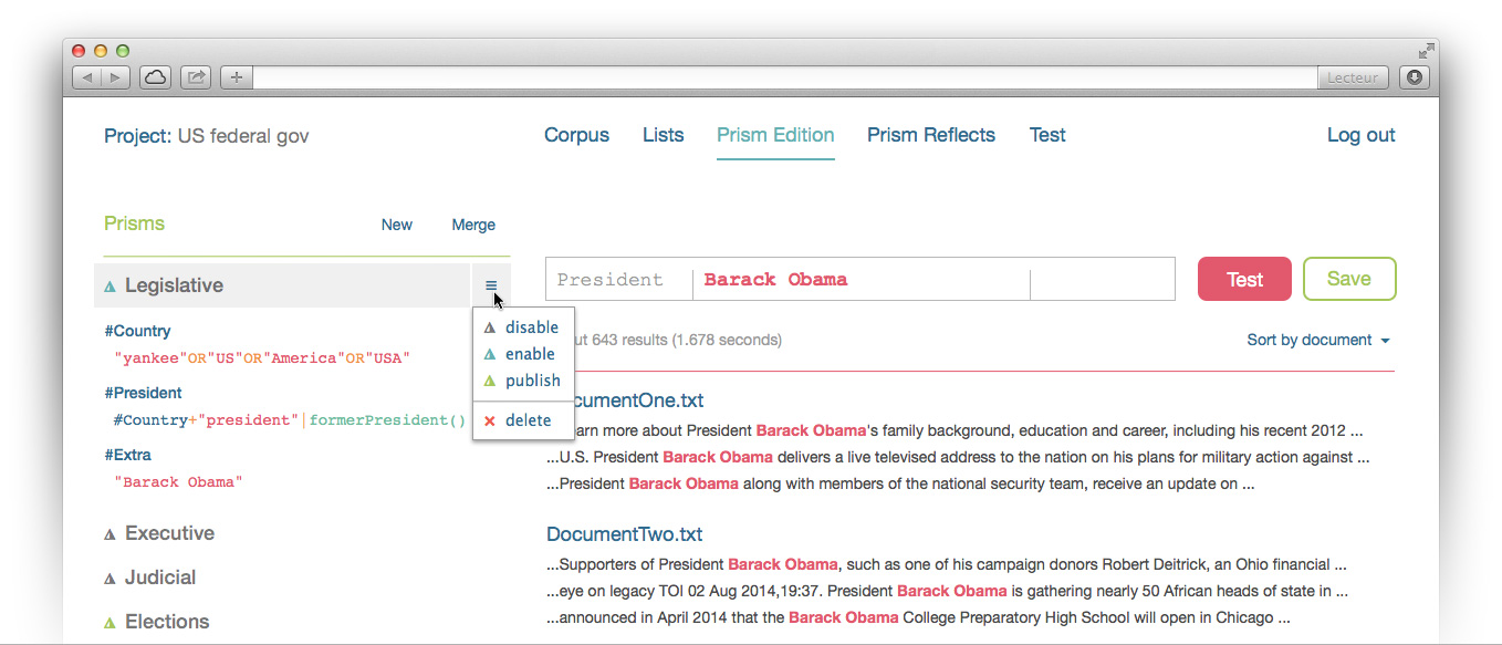
From this visual direction, we started to work on the user interface of one of the company product. The purpose of the application is text content analysis, so the interface were based mainly on text, with very few icons to focus on readability. Color codes were build like syntax coloration, in order to provide a clear, meaningful and friendly environment to the user.
The visual identity of the brand also required the creation of a logotype. I chose simple and geometrical shapes to express the values of simplicity, clarity and flexibility. As on the UI, the text is the main element. The typography is curve, fluid and express flexibility. The visual evokes both a pen and a prism. The pen is the most simple tool to annotate a document, and the prism is a tool to split up white light into colors.
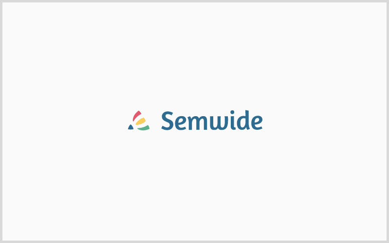
The prism is a little triangle. It is blue like the typography of the brand name to visually bind them. The color beams going out of the prism are drawing a bigger triangle, maintaining a unity in the forms. Those beams of light are curved to express flexibility, and remain visually coherent with the typography of the brand name. Colors are flat to be readable on any medium and size.